Create a user focused, metrics backed website for an organization that has diverse offerings
Project Overview
The Michigan Institute for Clinical & Health Research (MICHR), based at the University of Michigan in Ann Arbor, aims to accelerate discoveries toward better health. MICHR does this by offering various services that educates, funds, connects & supports research teams here at U-M and beyond. The MICHR website acts as a digital home for MICHR. This project involved redesigning the MICHR website from the ground up focusing on users needs.
My Role
I led a team of communication experts, writers, and UI designers through the end-to-end design and development process. This process included User Research, Information Architecture, Interaction Design, Development and Testing.
The Michigan Institute for Clinical & Health Research (MICHR)
The Michigan Institute for Clinical & Health Research (MICHR), based at the University of Michigan in Ann Arbor, is one of about 60 academic research institutions that have received a Clinical & Translational Science Award (CTSA). The award aims to accelerate discoveries toward better health. MICHR does this by being a catalytic partner that educates, funds, connects & supports research teams here at U-M and beyond. MICHR is organized into various administrative groups that are called MICHR programs. Examples include Clinical Research Informatics and Participant Recruitment.
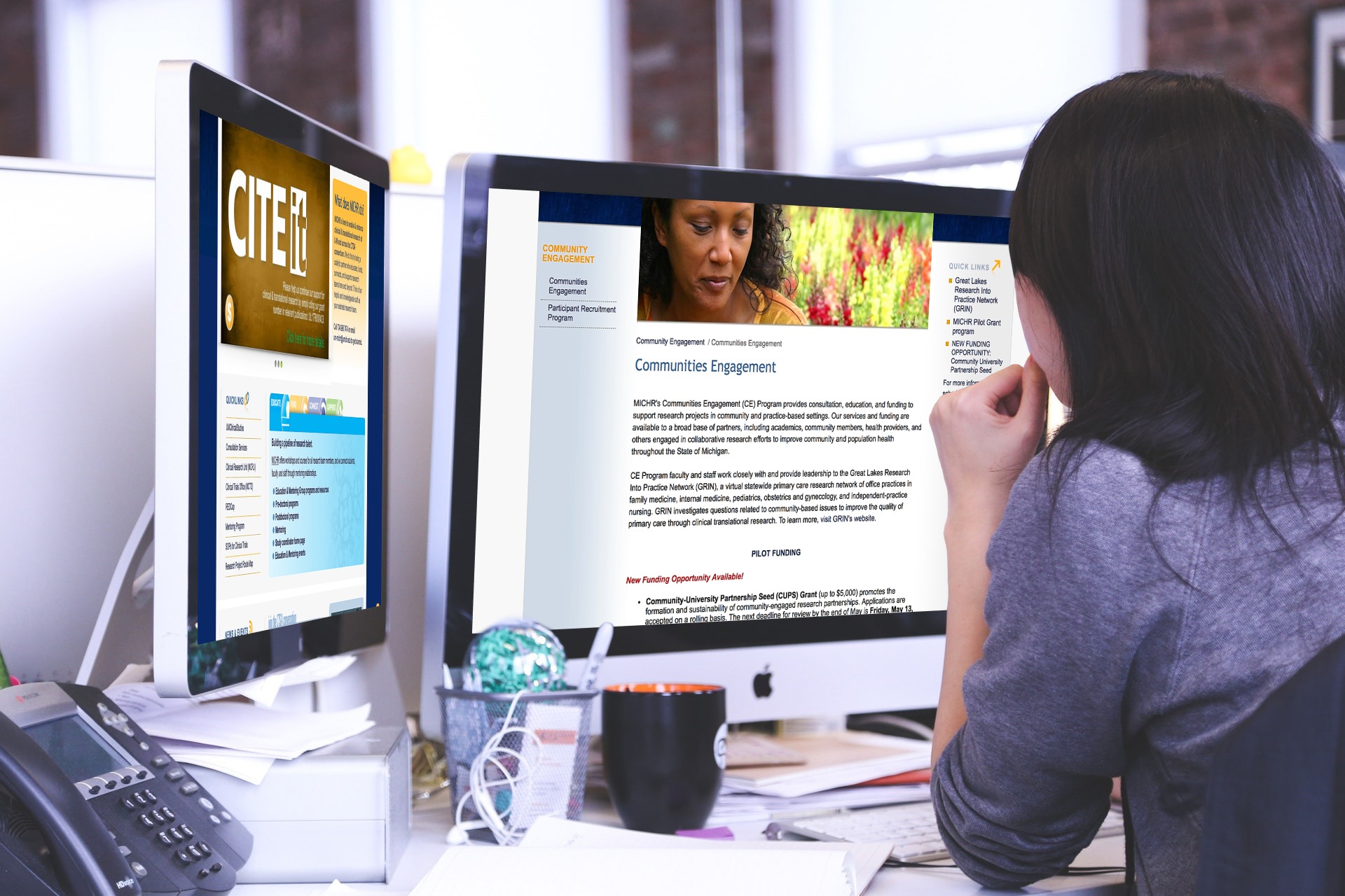
The MICHR Website
The MICHR website acts as a digital home for MICHR. It was first created in 2007 and then redesigned in 2011. The website is owned and managed by the Communications team at MICHR.
Content Management Model
Since 2011, the Communications team employed “distributed content management” which refers to the idea of spreading content management responsibilities across an organization, usually with a prevailing goal of empowering users. Each program within MICHR had a person responsible for keeping their corresponding program’s content current. The person had a relatively free reign in the content that got published. The focus was on increasing the volume and quality of content by having subject matter experts directly involved in content creation rather than funneling it through the Communications team. The Communications team periodically reviewed the content mostly for the quality of writing and consistency.
Content Organization
The content was organized primarily around MICHR departments/programs. The information was stored in web pages and the website did not have formal content types outlined.
Why the redesign?
Old MICHR website
The Communications team conducts periodic evaluations of the MICHR website to ensure success and effectiveness. These include mining customer service data, analyzing website usage data, talking to customers, checking in with MICHR staff and evaluating business goals. In early 2015, the team started noticing some trends while evaluating the site. These included, among other things, a difficulty for users to find the information they needed, a sizable population of users who were having trouble trying to use the site on their mobile devices, and a lack of understanding on the content presented. To explore these issues further, the team created a project to deeply evaluate the site in accordance with it’s users needs. What follows is a description of that process and the results it led to.
Process
1. Design Research
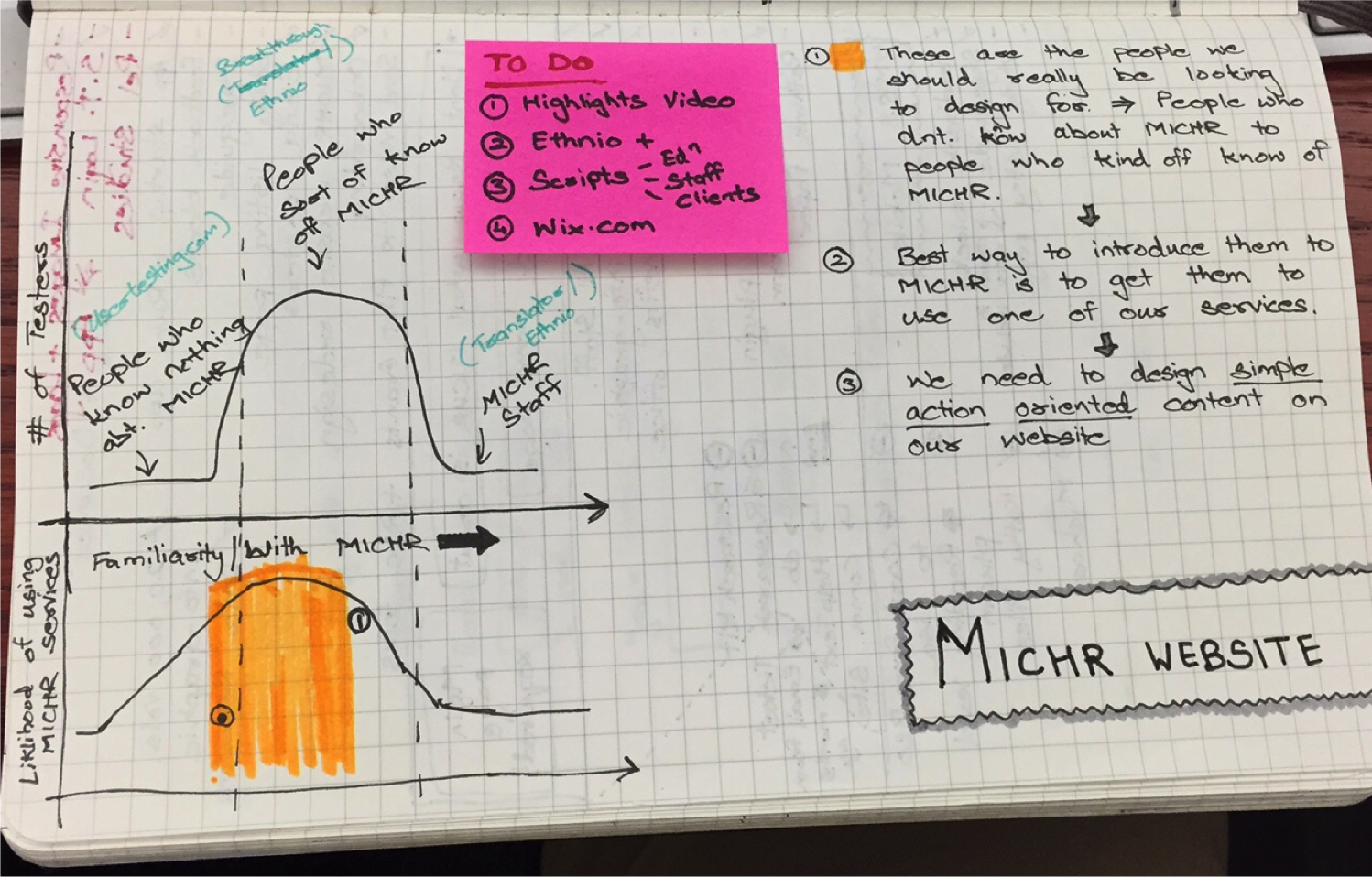
Who should we interview? What should our design research strategy be?
We aimed to employ quantitative design research methods to get a broad understanding of the issues that users face while using our site. We then wanted to employ quantitate design research methods to go deeper than just opinions and assumptions and explore the issues with the lens of latent needs and behaviors.
We decided to choose people at the extremes as our core interviewees so as to garner a broad understanding of the experiences people have while using the site.
We decided to choose people at the extremes as our core interviewees - people who had no idea about MICHR or even about health research at one end and people who were experienced health researchers and even heavy MICHR users at the other end so as to garner a broad understanding of the experiences people have while using the site. We hypothesized that if we could make the website workable for people at the extremes, it would automatically work for people in the middle. That being said, we did interview some users “in the middle” - users who were recent entrants into the field of health research and were either not aware or only vaguely aware of MICHR and it’s offerings, to garner their feedback as well.
1.1 Website Analytics
We first looked into website analytics (Google Analytics) data such as number of visits, bounce rate, platforms that our users were using (desktop vs mobile), the pages they were visiting and more to see if we could spot any usage trends.
1.2 Remote User Testing
Simultaneously, we also conducted remote, unmoderated user testing sessions through an external tool, Usertesting.com, with 5 testers to establish rudimentary usability and readability issues in the site. The testers were external to the University of Michigan and had little to no experience with health research related content. The testers roughly represented the device usage we had observed from our website analytics. At the end of the session, the testers completed a small questionnaire that asked them what they liked and disliked about the site, what would they change and finally, would they recommend the site to their colleagues.
The above two methods gave us a broad, albeit shallow understanding of some of the major problem areas with the site.
1.3 In-Person Contextual Interviews
To gain a deeper understanding into the issues that were surfaced using the two design research methods above, we conducted 7 deep, in-context user research interviews with relevant stakeholders of the site. These included MICHR leadership, MICHR staff, past MICHR clients and potential MICHR clients. This group comprised of the other extreme of our potential audience segment - users at the University of Michigan experienced with health research related content. These interviews were set up in the users workplace and included us spending time with them to understand their work, their motivations, their beliefs, if and how they used the MICHR site and the barriers that they faced.
1.4 Polls and Surveys
We also conducted polls and surveys to establish how wide spread some of the issues that we had uncovered were and to get deeper opinions on some specific topics.
2. Insights from User Research
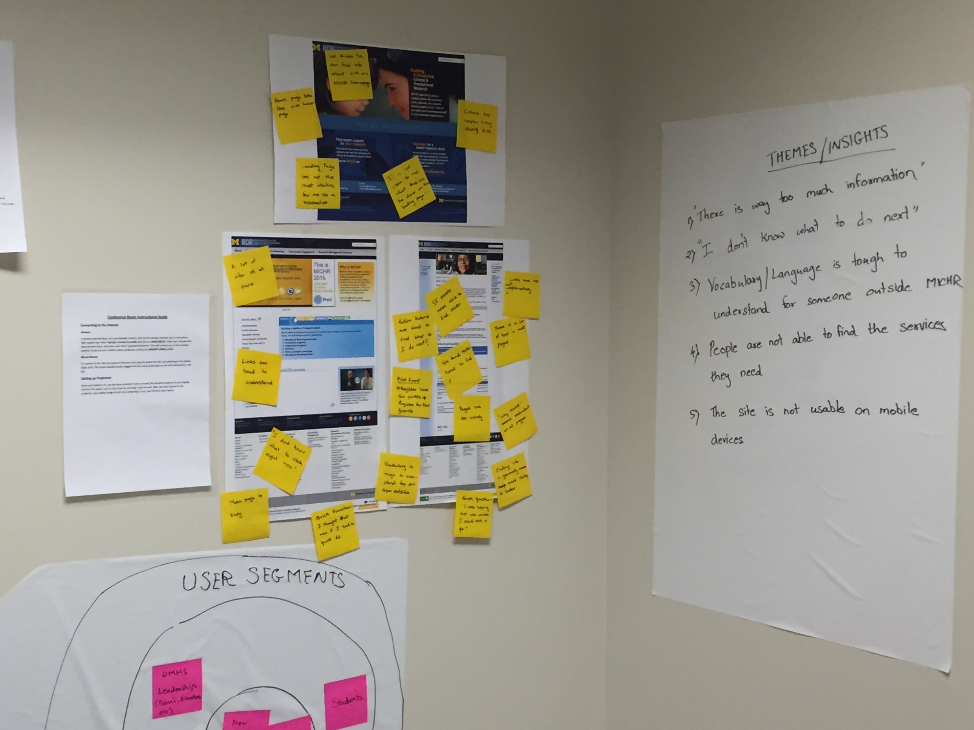
Our team room. On the left is feedback from users on the old website while the right shows synthesized insights from the design research phase.
2.1 Who is the audience?
Our user research revealed that the content on the website was attempting to serve various audiences, without serving anyone well. The website contained information pertinent to MICHR staff, information for the CTSA consortium and the National Institutes of Health (NIH), internal MICHR program information, service offerings for clients, educational courses for students and a large variety of resources for health researchers and staff.
2.2 Overwhelming amount of information on the site
There is way too much information in there!
—— Research participant
As a follow-up to section 2.1, our users expressed feeling overwhelmed with the amount of information on the website. One interviewee quoted “There is way too much information in there!”. When we performed an inventory of the site, we realized that there were over 400 pages of static content on the site, excluding ones that are added regularly like news and events. Adding to that, each page itself was heavily worded and very dense in nature.
2.3 Vocabulary used on the site was difficult to understand
The interviewees were not always able to understand the content that was presented on the site. It emerged that the content was authored with a lot of internal acronyms and jargon which made it very hard for users external to MICHR to make sense off. An evidence of this was presented through a couple of the user testing sessions, where the users did not realize that they had actually successfully completed a task at hand because the content was hard to comprehend.
2.4 People were not able to find the content they needed
As a continuation of the above two points, users were not able to find the content they wanted to get to. This was evident in the unmoderated user testing sessions where users failed most tasks which involved looking for a certain MICHR service or a certain piece of content. This was also evident in the in-person contextual interviews where users narrated tales of not finding the information they needed or not understanding what MICHR was.
2.5 “I don’t know what to do next”
In cases where our users found the content they were looking for, which in most cases was a MICHR service they were interested in, they did not know what to do next. They were unsure whether they needed to fill out a form online, contact MICHR vial email, call the number listed at the bottom of the page or contact someone they knew personally within MICHR. For the unmoderated user testing sessions, users spent a lot of time contemplating what their next step should be once they had found the content they were after while in the in-person interviews, users narrated instances of how they had felt unsure and tried different ways to request MICHR services after learning about them online.
2.6 Tracking effectiveness of the content presented
The design research revealed to us that we did not have good metrics in place to track the effectiveness of our content. While we could track the number of users visiting a certain page and demographics related to that, we could not really tell if those users had a successful interaction with the page. This was also because our content was not authored to convert visitors to users of MICHR services.
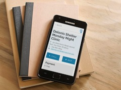
2.7 The site was not usable on mobile devices
About 13% of our users were trying to access the site on a mobile device. The site was not built to work on mobile devices and hence was very hard to use on it. Users reported being extremely frustrated while trying to use the site on a mobile device.
3. Design Goals
The team then turned research insights into goals that our designs needed to hit to build a successful product.
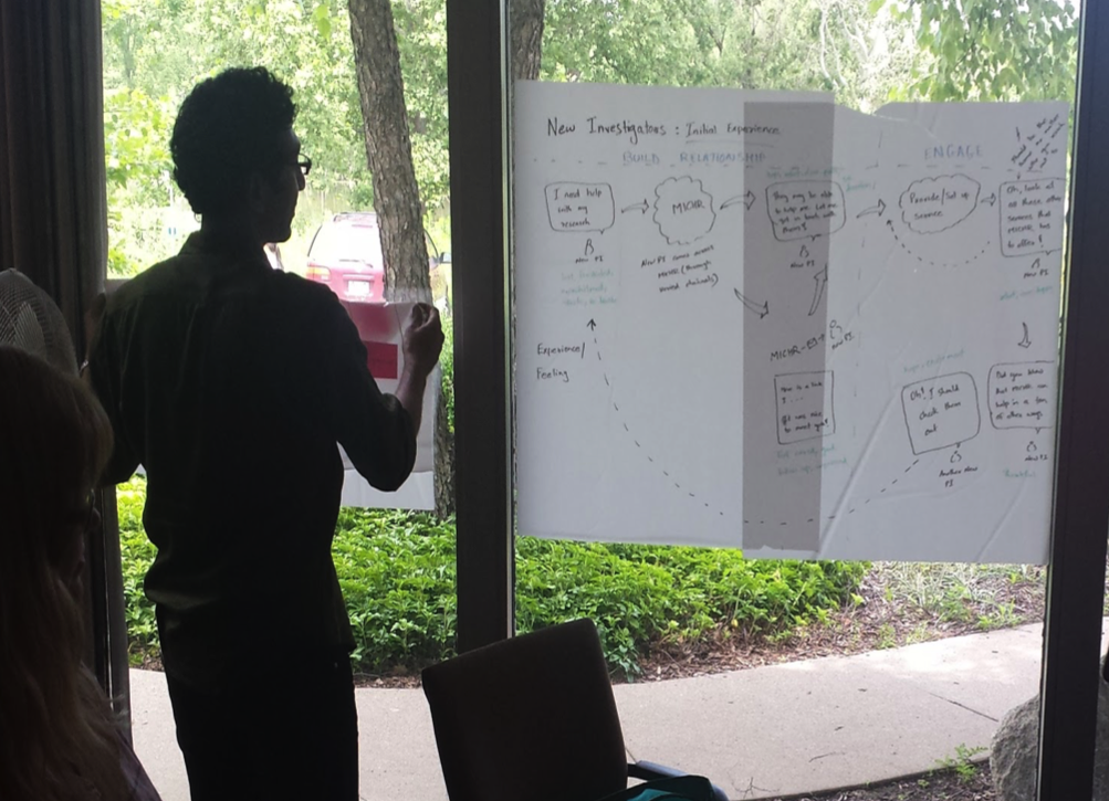
3.1 Establish core audiences
An experience mapping workshop to understand MICHR’s audience and their experiences
As a first step in the process, the team realized the need to establish the core audiences that the site was going to serve. Assimilating insights from our design research we established that the audiences that needed the site the most were health researchers, namely individual investigators and study teams. They were MICHR’s primary clients. Segmenting further, we realized that less experienced investigators who were either unaware or only vaguely aware of MICHR and its services would look online for help with their research. More experienced investigators who knew about MICHR usually seemed to have existing personal relationships within the organization. They sought information from these relationships and rarely ever went to the website for their needs. Students and aspiring researchers were also an important segment of users for the site for information related to educational offerings.
3.2 Transform content from being MICHR program based to service focused
As noted in the “Background” section, MICHR’s site was organized by it’s organizational groups or programs. Following up from section 3.1, we realized that our core users really needed information about the services that MICHR provided and not who within MICHR provided those services. Additionally, they generally did not care for auxiliary information about a particular program like its history, it’s organizational structure and its team members. This way of organizing information added to the difficulty in navigating the site as users did not always know which services were housed under which programs. It also contributed to content bloat or the feeling of “noise” in the content. It became clear to the team that for it to be easier for the intended audience, the content had to be reorganized from being MICHR program-based to being service-focused.
3.3 Organize services by topics and audiences
Our design research revealed that the users sought help with certain broader themes or topics that they were wrestling with. These themes did not always reconcile with MICHR’s administrative programs. As an example, the junior investigators we interviewed were interested in funding opportunities that MICHR had to provide. Funding opportunities in different formats were offered by three separate MICHR programs - Education & Mentoring program, Pilot Grant program and the Community Engagement program and investigators would need to look at these various program pages to get a sense of all the funding opportunities available to them. In addition to writing service-focused content as described in 3.2, it highlighted the need for us to organize the services based on topics that our users were thinking about.
Our design research also revealed that users did not always know what they did not know. This again was especially true of research teams starting out their health research journeys. It emerged that they needed to look at all the offerings that would be available to them as an audience to know what they had, and what the missing pieces in their research setup were. This called for creating a secondary audience based navigation structure.
3.4 Each service needs to have a trackable call-to-action
As a response to insights presented in sections 2.5 and 2.6, we realized that having a call-to-action on every service page allowed for users to take the next step when they found a service they needed. It also allowed us the ICE team to track conversion rates for each of the the services and in turn get a better read on the effectiveness of their content.
3.5 Write content assuming users do not know anything about MICHR
We also realized that we needed to write content assuming that our users were completely unaware of MICHR. That implied being very frugal with the usage of acronyms, explaining concepts where necessary and maintaining a low readability level (Grade level 8).
4. New Information Architecture (IA)
Following on from the insights gained during user research, we realized that we needed a formal information architecture (IA) for our website.
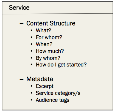
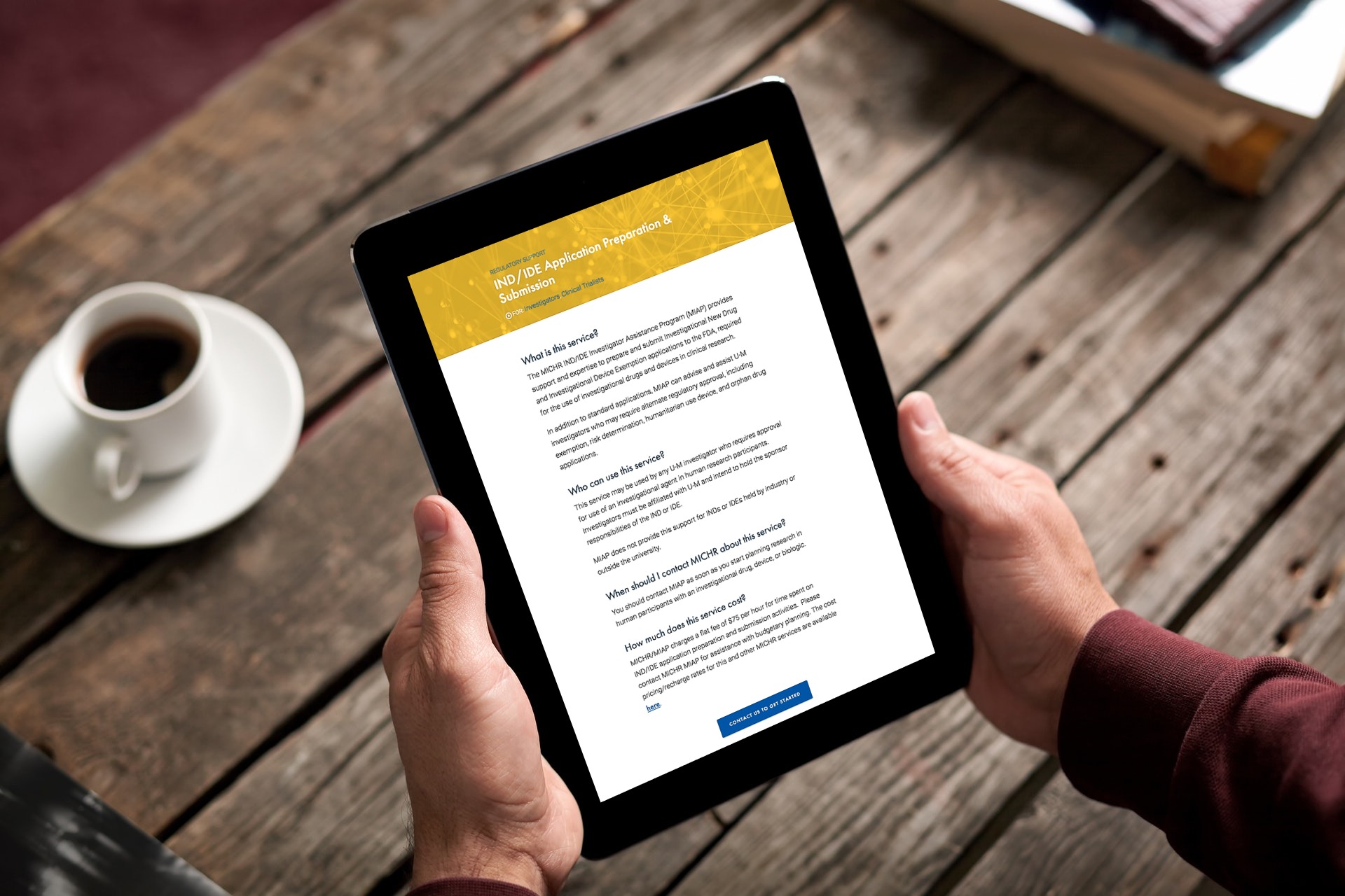
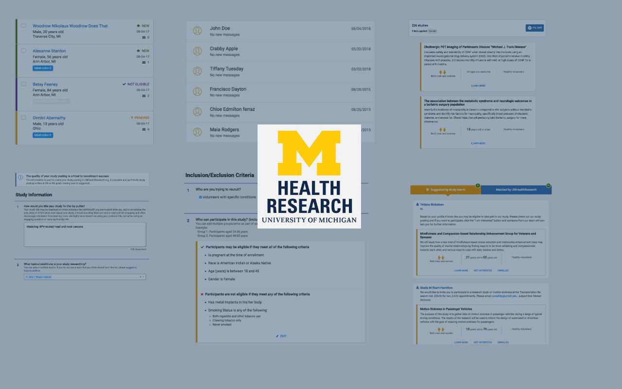
4.1 Content Types
The Content Structure and Metadata for the “Service” content type. We defined all other content types in the same way.
We needed to think in terms of storing information in reusable content types and not static web pages. This would allow the presentation to be consistent and the content to be searched and organized in many different ways. We came up with the following content types:
Service
News
Events
Staff
Resource
Each content type had a set of properties(metadata), a content structure to store and retrieve information consistently.
4.2 Categories and audiences
After defining our content types, we proceeded to create a taxonomy that could tie relevant content (either within or across content types) together. As an example, if a researcher was browsing for services related to a particular topic, we also wanted to show them events relevant to those topics. Through card-sorting, polls and other activities, we centered our taxonomy around topics that were important to the various audience segments that MICHR serves. This allowed users to find the same information using either the topics or by identifying with an audience segment.
Convincing stakeholders about a new design direction takes time and effort, and is an important skill to master as a design leader.
4.3 Convincing stakeholders to embrace the new IA
Convincing MICHR teams to focus on the services they offered took time and patience. We showed them videos of users talking about the website, we brought them into user testing sessions and we presented data on where users were falling off. Seeing users struggle through their content helped change their mindset from being MICHR program based to being service focused.
5. Prototyping
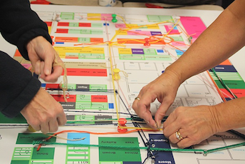
5.1 Paper Prototypes
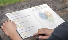
We developed paper prototypes to get a quick handle on the layout and interactions on the site. We tested the paper prototypes with users to gain high level feedback.
Prototyping content needs different strategies than prototyping visual UI elements.
5.2 Web Prototypes
To really understand how the new IA would work with real content, we quickly moved on to creating a real web application. We used an off-the-shelf blogging platform to mimic the information architecture of the site. We then took up some content from our existing site and re-authored it to fit the new IA.
6. User Testing
6.1 Remote User Testing
We went back to usertesting.com to conduct initial tests using the prototype. Again, our aim was to catch rudimentary problems that would seem common-sense to someone from outside the U-M system. We kept the tasks similar to the first time around and compared the results. The new IA performed significantly better than the old one on all tasks.
6.2 In-Person User Testing
We then asked our users in the field to comprehensively evaluate the prototype. We met with researchers, community members and administrators in their offices to test the prototype in the wild. We refined the site based on these learnings.
7. Setting a UI Design Direction
An example page from MICHR’s design system. To create a design system we worked our way from the smallest element (atom) to more additive components.
Once we built confidence in the content strategy and IA, we went about creating a UI direction for the site. We used atomic design principles to work our way from small to large. To fixate on the typography, we first started with the element that would contain the most text — the Service page. Then we worked on the form elements. We then moved on to more additive elements, including the snippets that are shown on the various content results pages. The branding was set to the University of Michigan’s style specifications. The home page was the last piece we designed.
Our research told us that the user experience of this site was heavily based on its content. We adopted the government’s 18F Content Guide to write user-centered, accessible and responsive content on the site.
9. Production Development
We built the site on the Squarespace framework. We found that it took care of a lot of the foundations of content management while giving us the flexibility of designing the user experience. We purchased a Developer’s License and I built our very own template in-house.
Results
You have raised the bar when it comes to the design of academic websites.
—— Stakeholder
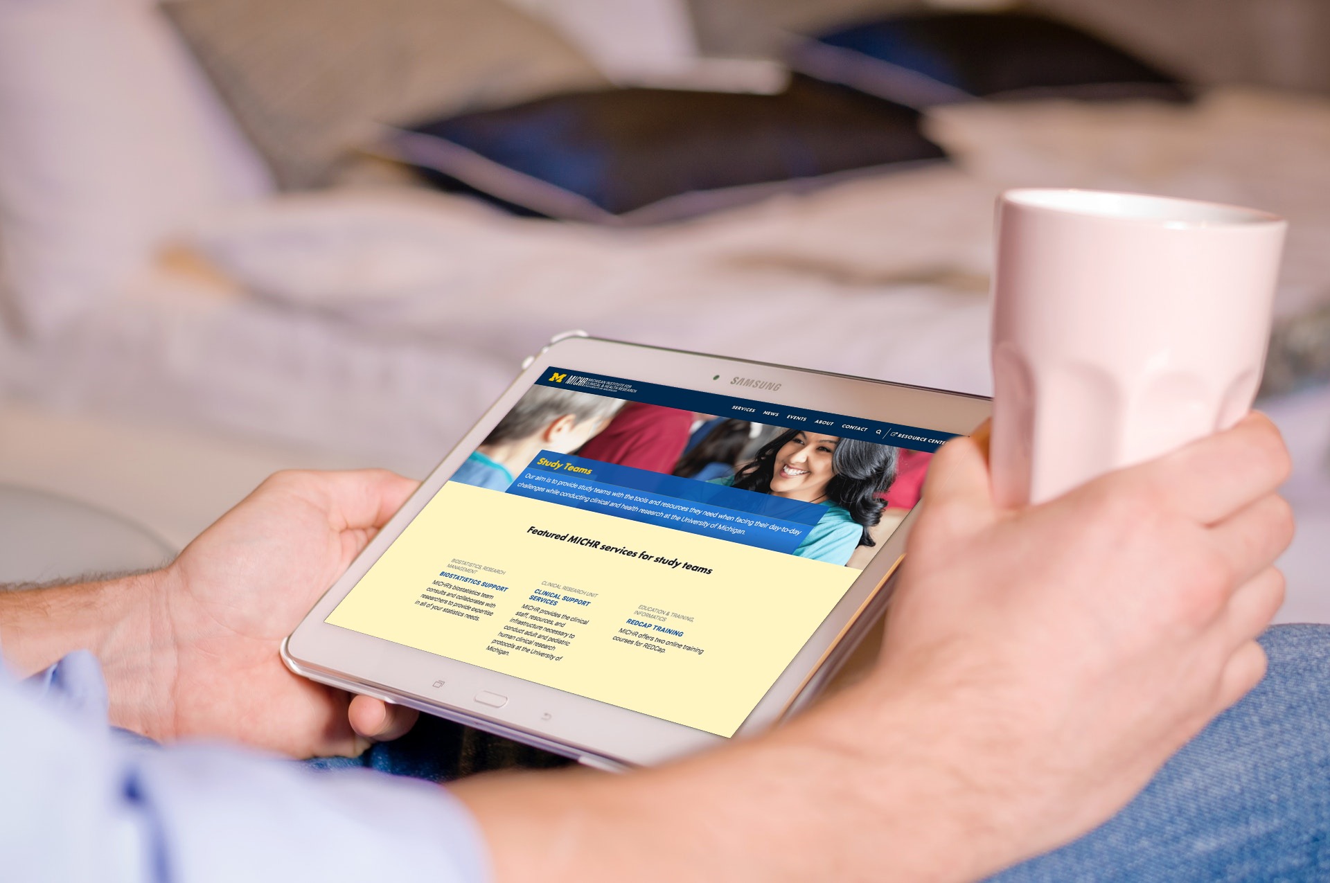
Redesigned main pageServices grouped by user-focused topicsServices organized by audience segmentsA service page with a consistent content structure A redesigned people directory
The redesigned website has had a significant lower bounce rate, has a much larger pages/visit number and has a higher percentage of returning users. The website has also resulted in increased conversions (users asking for services), fewer support calls asking for resources already on the site, and our tests have shown, a greater understanding about MICHR and its offerings.
With all the focus on visual UI elements — branding, animations, parallex effects etc — often times it is the content and how it is organized that can make or break a site.
Getting content creators to write user-centered, accessible content demands that they be involved in the design process.
Convincing stakeholders about a new design direction takes time and effort, and is an important skill to master as a design leader.