Set the UI design direction for a complex web application
Overview
Setting a UI design direction is a tough ask that needs thinking at the systems level. It is easy to loose sight of the granular user experience when working at that scale. For UMHealthResearch, we relied on a few core components of the user experience to lay a foundation for our design direction, and then proceeded to build more complex interactions.
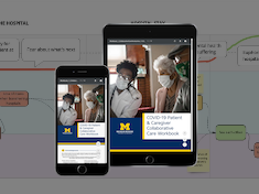
UMHealthResearch
UMHealthResearch is a platform that connects the public to health research studies. Born out of the University of Michigan, the platform is now being adopted by various Universities across the country.
Our user research in the field taught us that our users were diverse in all respects. It also told us that using UMHealthResearch.org was something that users, especially our volunteers did sporadically. There is also a lot of jargon, misinformation and misrepresentation about health research in the world. This information formed the basis of our overarching design philosophy. It lead us to believe that our final designs needed to be visually simple, with discoverability being the primary objective and efficiency being the secondary.
2. Identify core UI components
UMHealthResearch is a double-sided marketplace, which means that it has two distinct audiences—volunteers and researchers. We made a conscious decision to start with our volunteers. Without them, there is no UMHealthResearch. For our volunteers, finding studies, understanding the details about those studies and providing information while showing interest in a study, are central to their experience. We mapped these experiences to the UI components that bring about these experiences. That left us looking at the following UI components as core:
A study snippet/handle that volunteers can use to pick a study
The study details page
The form that volunteers complete to show interest
3. Establish what visual treatment will make these core components succeed
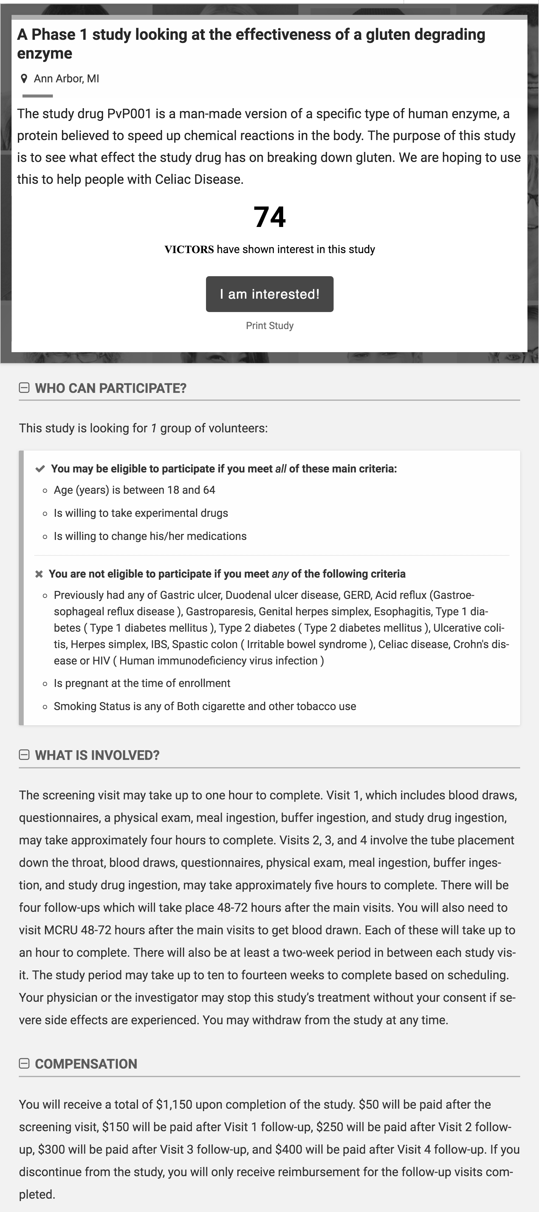
3.1 Study Details page
An un-styled study details page. A typical study page on UMHealthResearch contains a lot of textThe study page after we set the typographic system
We looked at the study details page first. The page exists to communicate information about a study to potential volunteers. This information is communicated through (sometime dense) text. That meant the most important thing this page needed to succeed was good typography—typography that was set for long, dense passages of text. Through the process of trying to make this page work for our volunteers, we finalized our body typeface (we decided to go with the one suggested by the University), set our typographic grid, and picked our font colors. In other words, we started to lay the foundations for our typographic system that we then ended up building upon and using throughout the platform.
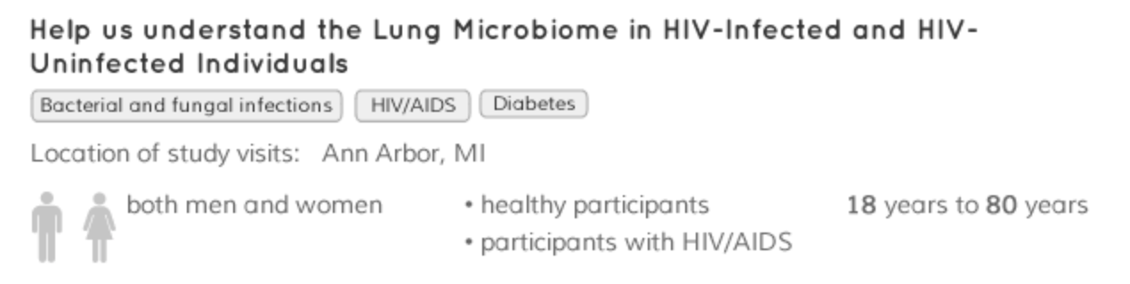
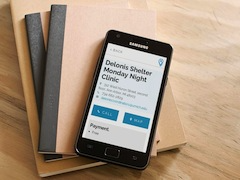
3.2 Study Snippet
Our first attempt at a study snippetThe eventual card-based study snippet
Now that we had a typography system, we took to designing the study snippet. Our research had told us the pieces of information volunteers were using to decide if they wanted to know more about a study. We also knew that studies could have different states (new, actively enrolling, not enrolling etc) that we needed to distinguish between. This was our first chance in the project at chunking overview information together in a snippet. We first tried a simple box with the information in it. When we showed this to our volunteers, they felt overwhelmed. We then researched successful ways to present heterogenous chunks of scannable and actionable information on a single topic. There is a lot of literature out there on this topic but for our purposes, Google’s Material Design’s cards pattern fit that bill. We tried study snippets in form of cards. Volunteers reacted better to this presentation—it provided them with clear separation between the studies. Volunteers felt it was easier for them to understand each study, and in-turn take action on it. The card pattern became the foundation on which we built more complex design interactions, especially where presenting heterogeneous pieces of information was concerned.
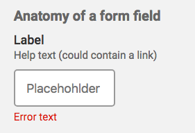
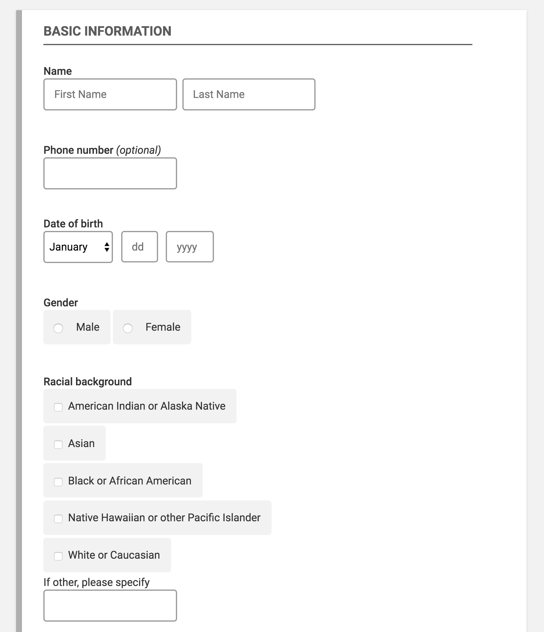
3.3 Forms
Anatomy of a form fieldForm elements
Given the diversity of our users, we needed our forms to be obvious and clear. We started with designing the text input fields. We maintained a larger than normal field font size, and created a standard for how and where our errors would display. We then moved on to radio buttons and checkboxes. We maintained large clickable areas for use on multiple devices. The cards pattern helped us design the field-sets. It was then time to look at more complex components such as usernames and passwords. Testing this particular form with users helped us set the standard for all forms on the application.
4. Set up your color palette
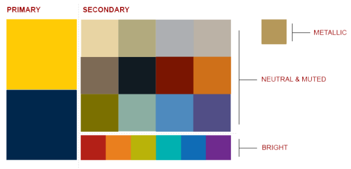
U-M’s established color paletteComponents with colors applied
Our next order of business was to think of colors. Our volunteers had pointed out that they trusted the University of Michigan (U-M) brand, and it played an important part in their decision to participate. Breaking away from the U-M brand would mean risking our volunteer’s trust. That being said, being exactly like all other websites on campus would mean losing our identity, especially with study teams. To balance the two, we stayed within the U-M color palette, picking primary U-M colors for overarching components such as headers and footers, but picking secondary U-M colors for smaller branding elements such as buttons and card-borders.
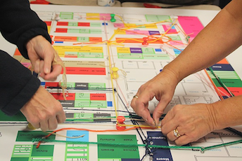
5. Incorporate these decisions into your design system
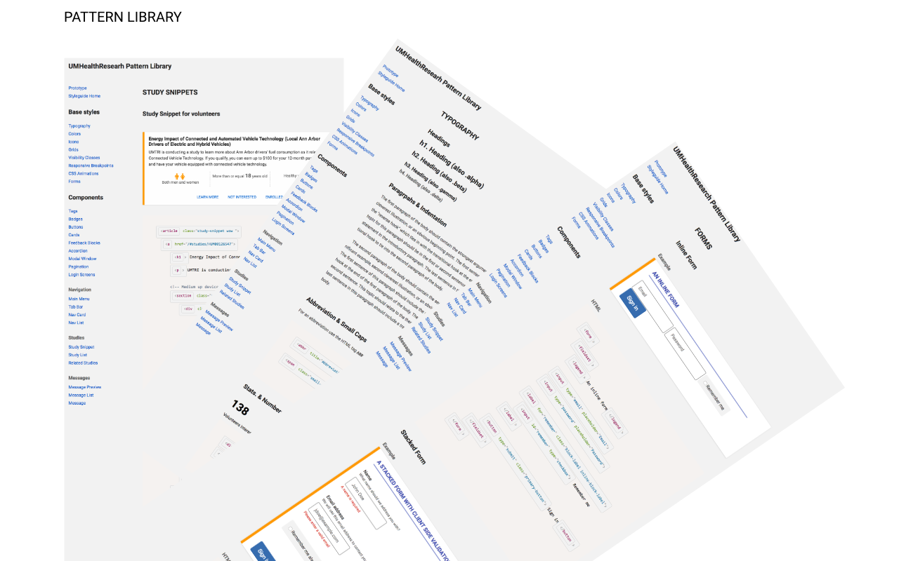
Starting to create a design system
We then incorporated the typography we designed for our study details page, the cards we designed for our study snippets, the forms and the colors into a design system with the goal to use these for the new components we worked on next.
6. Build more expansive components
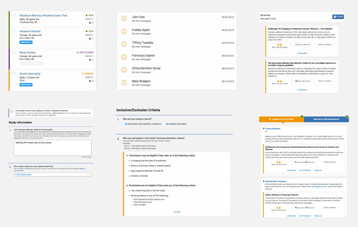
Examples of the more additive components we built using the the core components as a starting point
The decisions that we took with the fundamental components listed above became the seeds that would then germinate to form an entire design system. We built many, many more interactions after this point, but all of their origins can be traced back to the fundamental components described above.
Reflection
Setting a design direction is a tough ask that needs thinking at the systems level. It is easy to loose sight of the granular user experience when working at that scale. Focusing on a few core components of the user experience gave us a solid base to lay our design direction on. It helped us see immediately the effects that our decisions would have on pivotal micro-interactions. Once a design direction is set, you can build more complex components with predictable and consistent results.